Showing posts with label Maps. Show all posts

Friday, 22 April 2016

Lost in 1939 - The Misleading Map

When Findmypast launched the 1939 Register, Infographic maps which pin-point the place of residence were heralded as a valuable extra.  My grandparent's household at 30 Manor Road, Birmingham is pinned like this:
1939 Regsiter location map for 30 Manor Road, Birmingham

See the problem? The pin is in Sutton Coldfield, not Birmingham.

Mapping locations is a revealing technique for family and local history when the source contains spatial information.  The 1939 Register contains 3 pieces of location information for each household:
  1. Borough or district.  Counties were divided into four  types of units, County borough (C.B), Municipal Borough (M.B.), Urban district (U.D.) and Rural district (R.D.).  These units are listed in Understanding 1939 Registration Districts.
  2. Enumeration district.  Boroughs and districts were divided into manageable areas for an enumerator to cover.  They are denoted by the E.D. letter code.  The One Place Studies blog published a helpful explanation of the 1939 enumeration districts and provide a list of these administrative units.
  3. Street address. No explanation needed.
Extract of 1939 Register with location information highlighted

My grandparents lived in Stechford which was in the Birmingham County Borough.  A Vision of Britain through Time is a comprehensive resource for jurisdictions in the UK.  Sutton Coldfield was a Municipal Borough until it was merged with Birmingham in the 1974 re-organisation of local government.  In 1939 the boundary of Birmingham County Borough was:
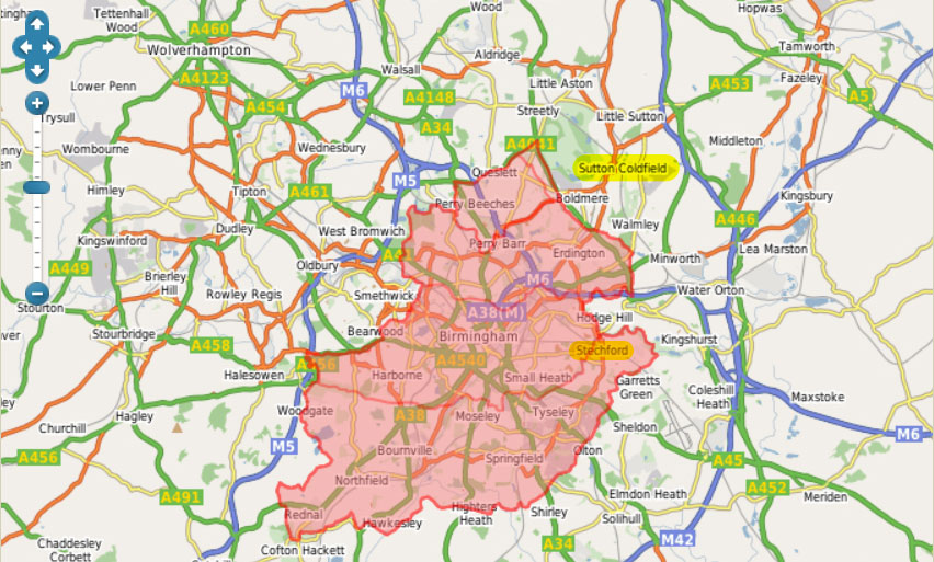
Birmingham County Borough, with Sutton Coldfield and Stechford highlighted.  Source: A Vision of Britain.

Sadly smaller units like enumeration district QBEZ are not mapped in A Vision of Britain.  Census enumerators books included a place to enter as description of the area covered, but I don't know if 1939 Register booklets did.  Browsing the 23 images in the district reveals that only pages with personal entries have been published, so the context of the enumerator's work is missing.  From the street addresses, it is possible to gain an insight of the area covered.  Seven roads are named: Lyndon Road, Manor Road, Church Road, Station Road, Rosemary Road, and Yardley Fields Road.

All of the roads in enumeration district QBEZ are incorrectly scattered around Sutton Coldfield on Findmypast's maps.  Here is a Google maps comparison of the real locations and Findmypast's locations:
Enumeration district QBEZ.  Roads denoted by lines are actual locations, those denoted by pins are the 1939 Regsiter locations
 
A road is a linear feature, so is better represented by a line than a point.  Road names like Manor, Station, and Church are common. There are even several Lyndon Roads. These roads have been matched with other roads of the same name.  Matching locations using a gazetteer, a geographical index of place names with co-ordinates or grid references, is fraught with difficulty.  Red House, Rosemary and Yardley Fields roads were all pinned to the same spot as the incorrect Manor Road pin.  It is likely that the more uncommon road names could not be matched, so were assigned to a pin thought to be in the enumeration district. 

Findmypast's pins mislead even when correctly placed.  A point or pin suggests accuracy, so one might expect it to identify a house.  An jurisdictional area like an enumeration district or borough is best represented by a polygon, a shape which denotes the boundary of the feature.

Mapping technology is now widely and freely available.  Findmypast used open source mapping software, Leaflet, to present the maps, delivering a smooth user experience.  That was a smart move.  Using the digitised historical maps from the National Library of Scotland and modern OpenStreetMap was another smart move.  All of that came free.

It is clear that the jurisdictional boundaries from A Vision of Britain weren't used.  Adding that data layer could have unleashed the power of spatial queries, eliminating the type of errors discussed here.  The data seems to be available only for academic use, but the website was built over a decade ago, so would greatly benefit from serious investment.  Investing in the development and expansion of A Vision of Britain would be, well visionary.

Wednesday, 25 November 2015

Mapping Wars...Or Other Events

Military service and wars, police actions, and other armed conflicts, were a big part of many of our ancestors lives. In the U.S. we ran into conflict with Native Americans several times as citizens pushed west. We rose up in revolution against Great Britain and fought them again in 1812. Fifty years later, we fought a bloody civil war. The 20th century brought the Great War, later known as World War I, World War II, the Korean Conflict, Vietnam, and the first Gulf War. Other countries have different wars but similar stories.

I spend a lot of time telling my ancestors' stories about war and military service. In my last post I shared how I researched my Scottish soldiers and wrote about their experiences. As I was researching my Jennings line from Virginia, I realized that five young Jennings men, brothers and first cousins, served with the same regiment during the Civil War. Virginia seceded from the United States two days after Union forces fired on Fort Sumter in South Carolina and President Abraham Lincoln called for volunteers to join the Union Army. Four Jennings men enlisted in the Confederate States of America's army the same day. My great grandfather, at age 19, joined them a year later on 1 March 1862. They all joined the 19th Virginia Infantry regiment.

With five ancestors in one unit, it made sense to tell the story of the regiment, highlighting along the way when something specific happened to an ancestor. I quickly discovered I needed a timeline to keep all the marches, battles, camps, disease, wounds, and so forth straight. And I needed a map so I knew where they were in order to describe terrain and weather conditions. There are some seriously well-done battle maps on Wikipedia, but none of them show how a regiment moved from place to place between battles. And those are the times a soldier got seriously foot sore!

Today, I'd like to share how I map the movements of a military unit. I'm not technical so I had to find a way that was easy yet produced nice maps and was informative. I think I have found such a method using Google Maps and any slideshow software.

At first I thought I could illustrate the entire experiences of the 19th Virginia Regiment on one map. But that quickly turned out not to be the case. Military units make many movements -- small and large -- and different scaled maps are appropriate for different situations. Here's an example of how small and large movements look together on one map:

Movements of the 19th Virginia Infantry after the Seven Days Battles to
Northern Virginia where they fought in the Second Battle of Bull Run or
Second Manassas; map created by Google Maps and PowerPoint

The above map illustrates a train ride from Richmond, Virginia, to Gordonsville and a 15-day march north to northern Virginia. Short marches and a battle are depicted by the pines labeled 1 through 3. The distance between Richmond and Pin 3 on modern roads is 95 miles. Only with a map can you quickly see the 19th Virginia Infantry traveled much further. Simply, listing the towns they marched through in text would not have conveyed the same information so quickly.

The following map illustrates a larger scale describing two battles which took place over a short period of time in the same general vicinity:

Movements of the 19th Virginia Infantry during the Seven Days Battles
illustrating two battles, the aftermath and where and when Daniel Rose and
Leroy Powhatan Jennings were wounded

To make these maps, I first research each battle thoroughly using online reference sources and offline sources such as muster rolls, unit diaries, and letters home. I wrote down each time a place and date are mentioned and, if included, the method of travel -- train, boat, or marching.

Then I go to Google Maps and click the menu icon:

Google Maps Menu Icon

Select the My Maps option from the dropdown.  A list of customized maps you have previously created will display or you can create a new map:

Creating a new map using Google Maps

Your customized maps are stored in Google Drive so you likely need a Google account.

Give your new map a title.

Titling your customized Google map

You can import text and images into your map, using the import link but I don't like that as I don't have total control of how it looks.

Now that I have my base map, I go back to the list of dates and places I created from my research. Type a place name in the text box at the top of the map and click the magnifying glass icon to the right of the text box.

Google Maps zooms you to the location. But you are plotting historical movements on a modern map, so you might need to look around to find exactly where you want to place your pin. For example, I know that the 19th Virginia Infantry was stationed in a swamp between the Warwick River and Yorktown, Virginia, on 26 April 1862. I zoom around until I find the Warwick River and look around for a suitable swamp between the river and Yorktown -- that's where I place my pin.

To add a pin, click the Pin icon and click the location on the map where you want to place your pin:

Adding a pin to identify location using Google Maps

You can edit the name of the Pin once you have placed it. I also usually delete the default location information provided by Google and add the date the regiment was at that location.

Once I have completed mapping movements during a specific period of time, I am ready to add further customization and descriptors to it in a way in which I can control the appearance. So I take a screenshot of my Google Map. How you do that depends on the type of computer you use.

Then I open Powerpoint (or another slide/presentation application) and open a new file. I reset the defaults to a blank slide and import the screenshot onto the slide. Again how to do that varies by application. All you need to know is where your computer stored your screenshot.

Once the screenshot is on the slide, you can use the features of the presentation application to add text, lines, etc. All this an be done using Google Maps but there are limits on the appearance of that information.

Once you have finished adding embellishments to your customized Google map. Click on Slideshow to get a full-screen presentation of that map. Take another screenshot. Save it. And voila! You have a map you can use to illustrate blog posts, upload to your family tree, or add to your website.

I use these maps not only for posts about military service, but also family migrations. It's totally up to you!

My latest maps are now appearing in a month-long series about the 19th Virginia Regiment on my blog, Tangled Roots and Trees.

Monday, 15 June 2015

Finding vanished houses

How often have you spent time looking at old maps and documents, tracking down places your ancestors lived in... but which don’t exist any more? Recently I’ve been doing a lot of that. So this month I’m going to share some of my ancestor-mapping with you.

Because the people and places I’ve been hunting for have been in London, I’ve been very lucky to be time-travelling in a place which has been regularly mapped over centuries.

Many members of the Worldwide Genealogy community will be much more experienced at this kind of research. Perhaps you’re part of a one place study? I’d love to read your comments and suggestions.


Reading Mercury report of the murder of Celestina Christmas
The houses I was looking for were 16 and 17 Murray Street, near the New North Road in the Finsbury/Islington/Hoxton area of north London in 1856. Confession time: the people who lived there weren’t ancestors, but they were part of the story of a horrible child murder which dragged my 3x great grandmother, Julia Harrington, into the newspapers - and of another child murder at the house next door to where the victim's aunt lived. You can read about them here.

At first, I couldn’t find a Murray Street in the right area. So either it had changed its name since the 1850s or it didn’t exist any more. The next step could’ve been a lot of searching, but luckily there are two useful sources for older London street names: the Survey of London and Pubs History.

The Survey of London was published in the 1890s and is now easily available through British History Online, which is a wonderful resource for anyone researching 19th century Britain. Pubs History is surprisingly helpful because it lists old and new names for streets in England. I’d come across it while writing about one of my criminal ancestors, who was transported to New South Wales for stealing a pub till. And Pubs History came up trumps: Murray Street was renamed as Murray Grove some time after 1938.

Leeds Intelligencer report of the McNeil murders
Now to find numbers 16 and 17. The newspaper report described them as ‘adjoining’, or next to each other. Usually odd and even numbers are on opposite sides of a street, but a quick session on Google Streetview showed that in Murray Grove the numbers run 1,2,3, not 1,3,5. Another problem solved. So where were 16 and 17? Streetview also showed me that none of the buildings in Murray Grove looked as if they dated back to the 1850s. And very few of them had house numbers. Luckily a search came up with a flat for sale in a tower block, no 13, which gave me a reference point to calculate roughly where 16 and 17 might be.

It was time to hit the old maps. There are so many online now, and London’s especially well documented at Mapco, a wonderful site (which also has a lot of historical Australian images). I’ve often found that the place I’m looking for is right on the edge of two different maps, and Murray Grove is no different. But I found some great ones for the right period.


Cross's 1861 map, with 16 Murray Street in green and 17 in red
Kelly's map of 1867, showing nos 16 and 17
Weller's map of 1868, the most detailed of the three maps

The part of the street where 16 and 17 used to be is unrecognisable now. Instead of houses and small streets behind them there’s a block of housing set back from the road. I've posted about what the houses might have looked like here.

I wondered why this area had changed so much. Had it been bombed during the Second World War? Again, there’s a brilliant website to go to: Bomb Sight, which maps the London Blitz of 1940-1941. And it shows that a bomb had dropped in roughly the same place as my two houses once stood.

Bomb Sight map. The two blue spots show nos 13 and 24 Murray Grove

I wanted to get a feeling of Murray Grove on the ground. I was in the area a few days ago and that gave me the chance to get an idea of real space, which even the best maps can’t give you. I even found another numbered tower block, no 24, so I had better co-ordinates to work out where 16 and 17 might’ve been – though after the bombing, there’d be less need to keep to the older layout of the street. Still, I pinned 16 and 17 down to a short stretch, just past the area where the orange-topped bins are now.

Murray Grove in 2015. The block at no 13 is at the extreme left of the photo. © Frances Owen 2015

Back at home I went back to the maps. I’d been puzzled by not finding nos 16 and 17 in the 1861 and 1871 censuses (had they been pulled down?), but they were there in the 1881 census. Phew. I headed for another website which had often come up with great results, the National Library of Scotland’s georeferenced map images, where you can see old Ordnance Survey maps overlaid on modern maps or satellite images. Counting the houses from the end of the southern side of the street, I thought I’d miscalculated by two. Nos 16 and 17 seemed to be a bit further on.

Murray Street, OS 25 inch, 1890s-1920s
But then I looked at a slightly newer, post-war map. The first two houses were marked 1a and 2a, then the numbers started again at 1 and 2. Who’d have guessed? And even handier, the two tower blocks I’d used for reference were built on the sites of two pubs, which were clearly marked. I’ve shown them with blue spots on the maps here. So my hunch had been about right, and I’d got 16 and 17 Murray Street.

Murray Grove, London/TQ, 1:1,250/1:2,500 1947-1964
I don’t know if this kind of research throws any huge light on the historical facts, but it gives me a bigger picture of the world these people lived in over 150 years ago. It brings genealogy to life. And though it was hard work, I do enjoy tracking down the places where my ancestors and their families and neighbours were. Do you?

Maps I used for this project:

Kelly’s Post Office Directory 1857: http://mapco.net/kelly1857/kelly05.htm
Cross’s New Plan 1861: http://mapco.net/cross1861/cross18b.htm


Newspaper reports: via findmypast.co.uk

Friday, 14 November 2014

Keeping up with the Joneses, or making sense of census place names

Well, it had to happen. Anyone researching Welsh genealogy is likely to find a Jones somewhere in their tree. I’d been lucky until I started looking at my paternal 2x great grandmother, Elizabeth Lloyd (c1820 – c1890).
I’m planning a post about how I discovered more about her on my A Rebel Hand blog, so I won’t go over the details here, but eventually I found enough evidence pointing to her being born Elizabeth Jones in Llandysul, Cardiganshire (now Ceredigion) in Wales. Jones! Now that’s going to make research into her family easier, I don’t think.
Some of the material I used came from maps. If you’re a regular reader of Worldwide Genealogy you’ll have noticed that I love maps, old and new. They can fill in so much detail about our ancestors’ lives and can help solve the problem of streets, houses and farms which have changed names as well as when they were built. I’m going to write about how maps gave me a bigger overview of the background of Elizabeth and her husband, John Lloyd, who married in 1841.
1841 Wales census via Ancestry
Here she is with her parents, Jinkin [sic] and Anne and her brother David in the 1841 census. (I still haven’t come near to pinning David down. David Jones in Wales? I mean, please!) But where are they living? It looks like Gwarllenoydor. Google couldn’t find anything like that. Luckily I had an image of Elizabeth’s marriage to John Lloyd which had Gwarllwynoedos as the farm’s name.
Image via Findmypast
Of course, census enumerators could have, ahem, eccentric spelling, and if this one didn’t speak Welsh he’d have made a stab at it without being able to recognise some words,such as llwyn, bush or grove. So armed with the new spelling I searched again and found... nothing. I went back to the census and looked for a nearby farm, Cribor, adding the parish name, Llandysul (also spelled Llandissil), to get an idea of where to look. Yes! It was near Pontshaen (also Pontsian).
Now this is where luck came in. I was looking at the family story that my Lloyds were related to Frank Lloyd Wright. I’d been intrigued by Eliot Ball’s Wikipedia Ancestor Challenge at North Sydney Family History (thanks to GeniAus’s GAGs for pointing it out). And Frank's family came from... near Pontshaen.
I tingled. I had a map of the area already saved!
Ordnance Survey map showing Gwarllwynoedos
And what a map. I’d found it by looking for Frank’s ancestors’ chapel, since his Lloyd Joneses were famous Unitarian preachers, and luckily it was a listed building. The Listed Buildings Online site led me to this Ordnance Survey (OS) map. And there, in the top right corner, was... Gwarllwynoedos. Thank you, genealogy map fairy! So, here’s a hint: if you’re looking for ancestors in Britain and they lived near an old or unusual building, try Listed Buildings Online.
Google map not showing Gwarllwynoedos
I find the OS maps better than Google's for places in the countryside – here’s the equivalent – and Bing is great for getting an idea of the landscape, which can be so important to how our ancestors lived and who they met and married.
Bing aerial view of Gwarllwynoedos area
But for finding named buildings, OS is the one for me. Why not try all three out for yourself? I’m not so keen on the OS’s own get a map feature, though.
After I’d had my genealogy happy dance, I decided to see if I could find where John Lloyd, Elizabeth Jones’s husband, lived. The marriage document said Blaencerdyn, also in the parish of Llandysul, which was backed up by the 1851 census (as Blaencerdin). I had no luck with the Blaencerdyn spelling, so I tried the other. This time Google recognised the name – but came up with Blaencerdin Fawr and Blaencerdin Fach, both in the same area of Llandysul. Fawr means big and fach means small, it’s a common pairing in Welsh place names, so I was fairly confident that I was looking in the right place.
But Google Maps didn’t recognise either spelling, so I tried GenUKI’s list of Llandysul farms. I was excited to see that Blaencerdin Fawr was in the district of Llanffrene, just like Gwarllwynoedos was. I tried the OS get a map site, and was thrilled to see that the two farms were near each other. Elizabeth and John were neighbours! So that’s how they met.
OS get a life map - you can see why I'm not mad about the picture quality
With this information, I went back to my listed buildings OS map and found Blaencerdin Fach. So I had the ‘big’ farm and the ‘little’ one on two different OS maps. I needed both on the same map, though.
OS map of both Blaencerdins
I took a gamble and zoomed in on the listed buildings OS map and got lucky. Hint – use the + and – symbols, not your mouse scroll wheel, they’re more accurate for this map.
But which one was John Lloyd’s farm? This is where Ancestry’s back and forward arrows on the census images came into their own. I’d usually pinpoint the building by seeing what their immediate neighbours were and check the enumeration district details at the beginning of the record, then hope to find the places on the map. But this time I got lucky. One page on in the 1851 census there was a family living at... Blaencerdin Fach! So I knew that John was at the ‘big’ farm, Blaencerdin Fawr.
OS First Series map showing Blaencerdin (top left) and Gwarllwynoedos (bottom right)
I could also have checked at A Vision of Britain, Ordnance Survey First Series 1:63360, 1805 to 1869, which shows the two farms as Blaencerdin and Blaencerdin Fach, or Old Maps Online, but I’d need the co-ordinates for that since Blaencerdin doesn’t come up in their search. I’d have needed more information to use the National Library of Scotland’s wonderful map-matching service, too.
There was one last map I needed to go to. My own. I mark the places where my ancestors lived using Google Maps. I added them to my Lloyds map, alongside Sadlers Hall, where John and Elizabeth's son Rhys (my great-grandfather) later lived. And only this week I was able to add Rhyol, another Jones farm. Now that was a real toughie to track down!
But this post is l-o-n-g enough already. I hope you weren’t put off by the length. I wanted to ‘show my workings’, as they told us to at school, and hope that something here gives you a helpful tip for using maps to trace ancestors from Britain, if you have any.
Have you got any map tips to pass on?

Thursday, 28 August 2014

Creating your own Google Map using the Mapalist utility

Earlier this year Jill Ball wrote about where our forebears come from.  She included a map of where her forebears came from.

An excellent utility for preparing Google maps highlighting specific places is Mapalist.

I have written about Mapalist previously on my own blog (Mapping the birthplaces of the children of John Way and Sarah née Daw).

First you create a spreadsheet in Google Drive. You enter the place names you want and the utility uses those names to mark the places on a Google map.

It was very quick to enter the data and generate a map. I used a separate column to enter the Australian state to ensure correct disambiguation of the place names.

Birthplaces of children of John Way and Sarah DawState
AdelaideSouth Australia
BinalongNew south wales
Collingwood Victoria
MurrumburrahNew South Wales
GrenfellNew South Wales
ParkesNew South Wales

You then go to https://mapalist.com. You do need to register for an account if you haven't already got one. You will need to allow Mapalist access to your Google account details.

Go to the tab Maps then choose create. Choose the source type of Google spreadsheet. Choose the worksheet you entered the data into.
Creating a map in Mapalist
You get a preview of the data being used.
After clicking next you assign fields to the columns. It did this automatically - I didn't need to change anything.
stage 2 of creating your map using Mapalist

I used a separate column to enter the Australian state to ensure correct disambiguation of the place names.

I clicked apply and then next

stage 3 of creating your map using Mapalist
In my case it had no problem in working out the places I meant.  If you have trouble then you might need to tweak your spreadsheet with extra fields to help locate the place you are meaning.

At the next stage you configure your map by choosing the pin you want.
stage 4 of creating a map using Mapalist
You can play around with the settings and preview your map


options in stage 4
Finally you save your map, having configured it as to whether you want it private or public ...


stage 5 save your map
You can preview

Immediately below the map are some buttons to click. The second one, a rectangle with an arrow emerging from it, is for sharing by email but clicking that also gives you the code to embed your map on any web page including your blog.

Et voila!


Good luck with mapping your family history.

Thursday, 31 July 2014

CuriousFox: a gazetteer and message system

Logo on www.curiousfox.com
CuriousFox is a gazetteer and message system that connects genealogists and local historians. Collaboration between these two groups is immensely beneficial.

In CuriousFox, every town and village in the United Kingdom and Ireland has its own page. There is also a USA version, which I have not personally used.

Things I like about CuriousFox include:
  • Exact map locations and historic maps.
  • Free to join, add entries, and search by village or surname.
  • With surname searches, finding relevant entries is easier because you can work at town / village level.
  • You can search for 'nearby' entries.
  • It is easy to edit or delete your entries.
  • Google searches will find your entries (so 'new relatives' can contact you).
  • No spam (your email address is not visible).
  • Privacy (the system sends messages between members, and you decide whether to give a particular member your address).
  • Advantages of being a paying member (about five pounds per year) include:
    • Contact and be contacted by all other members (free or paying).
    • Receive email alerts when people add entries for towns of interest to you.
    • Publicise your Web page or blog.

Entry screen for my ASHTON message
HINTS:
  • Give some thought to the wording of your entries. They should be concise, with surnames (and only surnames) in capital letters. Specify dates, and use appropriate punctuation.

  • For large towns with many entries and multiple pages, delete your entry every year and immediately resubmit it (updated if necessary) so that it reappears near the top of the list for that town. I did this recently, and within 24 hours a local historian contacted me and offered to send transcriptions of land records for that surname/town!

I hope you will try Curious Fox and share your success stories in a comment here. You might also like:

Wednesday, 14 May 2014

Hunting ancestors using old maps

I love old maps! Do you? They're such a good genealogy tool. They can help make sense of the census, correct wonky transcriptions and show how a great-grandparent's village became a suburb of a big city. If you're lucky, they may lead you to a place your ancestors lived.

And they can guide us in our travels into another dimension - back in time. Old maps can help put flesh on the genealogy skeleton of names and dates. They can confirm or challenge our ideas about how our ancestors lived. They can make our forefathers and mothers come to life. And for me that's one of the most fascinating parts of my genealogy journey.


I’ve used an old map before to try to make sense of the movements of one of my convict ancestors, James Thomas Richards, on the evening in 1835 when he stole a pub till and earned himself a free one-way ticket to Australia.

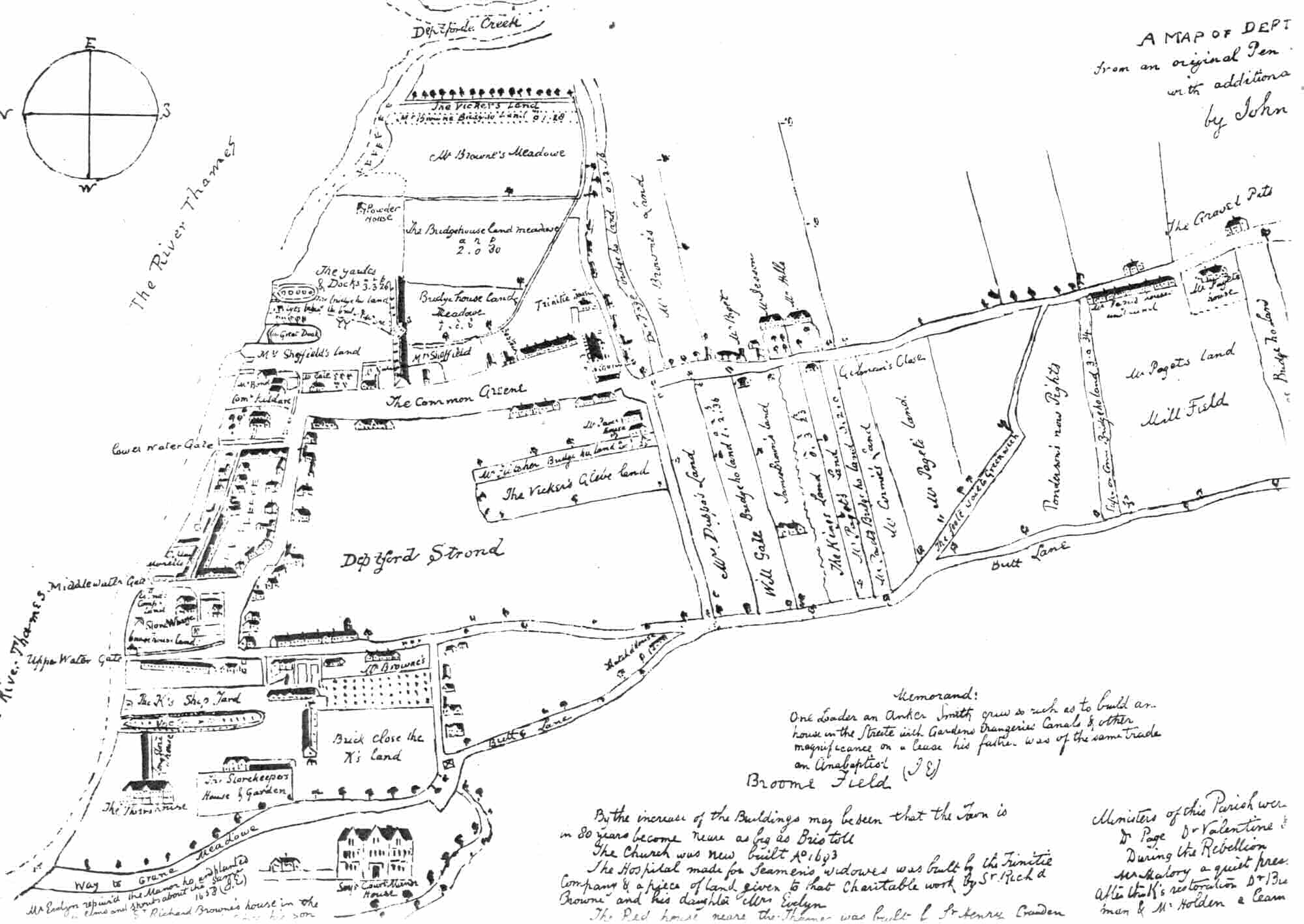
Hand-drawn map of Deptford. Creative Commons via http://www.ideal-homes.org.uk/lewisham/deptford/1623-map-01.htm
Map of Deptford, 1623, with John Evelyn's notes, late C17th
James was a Thames waterman, and lived in Grove Street, Deptford – then part of Kent, but now definitely in London. His father and he had both been born in that street, perhaps in the same house. So I thought it might be interesting to look at this small part of Deptford through maps.

Deptford is an interesting place from a worldwide perspective, too. In the Deptford dockyards ships were built and fitted up to sail to North America, Australia and many other far-off places.

It was from the wet dock in Deptford that Captain Cook set off in 1768 on board the Endeavour to ‘discover’ Australia. Convict hulks (prison ships) were moored in the Thames off Deptford. It was at Deptford that the prison reformer, Elizabeth Fry, waved goodbye to the Maria, a ship full of women convicts who she had helped. And two of Australia’s earliest convicts of African descent, Billy Blue and John Caesar, lived in Deptford before they, too, were transported to New South Wales.

Grove St, Deptford http://www.openstreetmap.org/copyright
I started my time-travelling with a map of modern London, because it’s easier to search. Of course, some streets have been re-named and others no longer exist, but I was lucky with Grove St. There it was, a longish street going almost north to south, close to the Thames. I wondered where James and his family might have lived. Had it always been this shape and length? Were there any old houses left?

A quick virtual trip via Google Street View squashed my dreams. Two Victorian pubs, a car breaker’s yard and a lot of post-war housing.

I wasn't really surprised. I hadn’t expected much to be there, thanks to the Blitz, which targeted London’s docks with great dedication . To give you some idea, have a look at this map, from the excellent Bomb Sight project. Some 650 people were killed in crowded Deptford during the Second World War, including 168 in Britain’s worst single V2 rocket attack on 25 December, 1944. Also killed that year were 13 US naval officers and ratings at an amphibious base supporting the D-Day landings. Such was the war in London’s East End.

It was time to look at old maps. My great-great grandfather, James the till-nicking waterman, was born in 1815 and convicted 20 years later. I wanted to find Grove St as it was in his lifetime.

Grove St in 1827. Website © Mark Annand
Now I'm not asking for much, am I? Only a 200-year-old map with enough detail to be able to make sense. And which reaches beyond the edges of what was then London.

Luckily, there is one. Greenwood's 1827 map, which can be seen online at the brilliant Motco and also at Bath Spa University's site.

So here it is - Grove St when my 2x great grandfather lived there. It looks very different. In fact I only recognised it because it starts at a T-junction just south of the larger dockyards.

It's much shorter, too. Only the northern part is called Grove St. To the south it's Victualling Office Row and skirts the huge warehouses where ships' stores were stocked, ready for the voyage.

Deptford in Mogg's map, http://www.geographicus.com/mm5/cartographers/
1806. Image via http://www.geographicus.com
What thrilled me was seeing that there are only a few houses in the 1820s Grove St, right at the top end. So my Richards ancestors will have lived in one of those. Now that's a bit better than the long snaky road in the modern map!
And there are open fields to the east side of the street. 

It's surprising to see just how much it was still in the countryside. I went to another favourite map to get a better idea of how rural Upper Deptford was. 

Mogg's Pocket Map of London was published in 1806. Here's a view of the area just before James was born. It's hard to square that country  with the overcrowded slums of 1944.

It doesn't look as if it had changed much even in the years since the 'Evelyn' map, right at the top, was drawn. Incidentally, if you'd like a proper look at that one,try here. And yes, it does look upside down.


http://www.mernick.org.uk/elhs/mapgallery.htm
1861. Thanks to the The East London History Society
In fact not a lot happened to the Grove St area for a while. Cross's New Plan of London, published in 1861, shows the new railway line terminating in Mr Dudman's Yard, just to the right of the street.

The dockyard closed in 1869. Sailing ships were superceded by steam, the same steam which drove the other new, fast form of transport - the train.

And with the docks no longer employing people, Deptford lost its purpose and began to slide into
poverty, and the grand shipbuilders' houses became overcrowded. There were hard times on the way.

Irritatingly, I haven't found any maps from the middle of the century which are detailed enough to show buildings apart from Cross's.


Charles Booth Online Archive http://booth.lse.ac.uk
So I'll have to shift my time machine up a gear and zoom forwards to 1889 and Charles Booth's famous 'poverty maps'. The Descriptive Map of London Poverty concentrated on the East End - the poorest part of London, it was generally agreed.

Booth based his classification of Londoners' economic status on visiting each area and talking to local people as well as looking around.

This snippet of his map shows how Upper Deptford was then, with better-off streets (in red or pink) to the south-west, poverty (dark blue) in the south-east and Grove St (a muddy-looking purple) described as 'Mixed. Some comfortable, others poor.'

You'll see that Grove St is now the same length as it is today, stretching all the way from the Wet Dock down to Evelyn St, where the red shading begins. It's built up along its entire length. And there are terraces of houses where the fields had been.

I've learned a lot writing this blog post, and I've enjoyed it, too. I'd add a lot of links, but this post is long enough anyway. So I'll be coming back to old maps on my own genealogy blog, A Rebel Hand, before too long.

And I'd love to hear what old maps you like, and if they've helped you in your genealogy journeys.

Unfortunately I am unable to respond to comments at the moment. I have attempted to credit all illustrations correctly and to use only images which are out of copyright when possible. If you would like to make any amendments, please email me and I will correct them.